
- Computing
It’s never too late to do the right thing
When you purchase through links on our site, we may earn an affiliate commission. Here’s how it works.
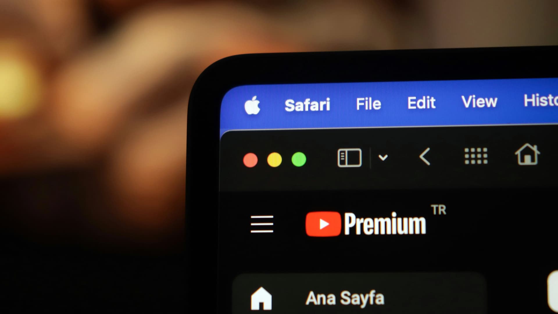
 (Image credit: Apple)
- Copy link
- X
- Threads
- macOS 27 Golden Gate has fixed menu icons on your Mac
- Menus are no longer stuffed to bursting with unnecessary icons
- That makes it much easier to find things at a glance
Apple’s macOS Tahoe operating system came in for its fair share of criticism, particularly when it came to design decisions. One of the most controversial concerned the way it used icons in menus, but it now appears that macOS 27 Golden Gate introduced at Apple’s WWDC 2026 event has backtracked completely — much to the relief of long-suffering Apple fans. And it has big implications for anyone who wants a better experience of using their computer.
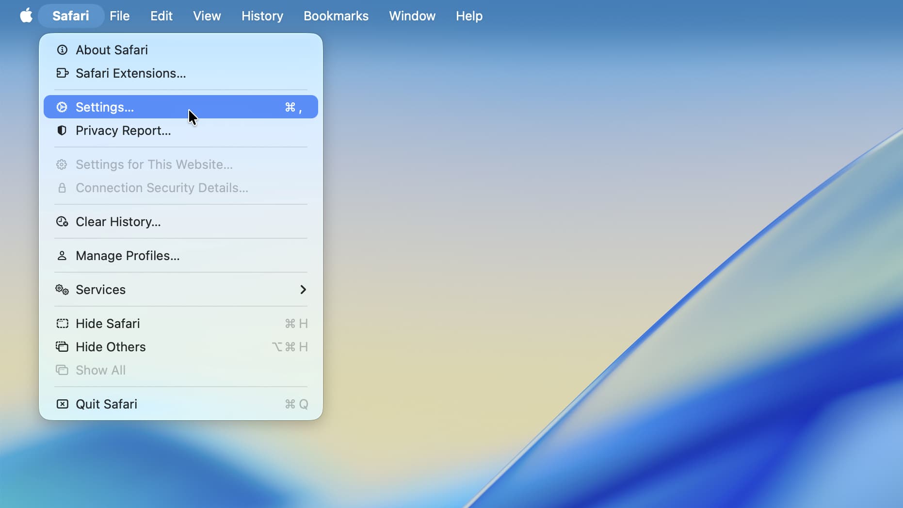
The problem in macOS Tahoe was that app menus were stuffed full of icons, making it very difficult to tell the difference between menu items at a glance. In macOS 27, that’s been scrubbed entirely, as noticed by programmer Nikita “Tonsky” Prokopov, with most menus now containing only a smattering of icons.
Now, only certain menu items have icons next to them, with others remaining simple text entries. That restores the menu design to the way it used to be and greatly reduces the visual clutter in macOS menus, reducing the work it requires to tell menu options apart.
Latest Videos FromWatch full video here:As well as the design change, Prokopov noticed that Apple has also updated its guidelines for third-party designers, reminding them to “use menu items sparingly and with purpose.” Icons should be used to “highlight the most common actions and key features of your app,” Apple says. If a menu item doesn’t fit an existing icon, it probably shouldn’t be used.
Better late than never
Menu design might seem like a pretty niche gripe, but it can have a big impact on how you use your computer.
You may like-
 Liquid Glass is getting a macOS 27 overhaul to fix its worst problems
-
 macOS 27 Golden Gate announced at WWDC 2026 — here's everything you need to know
-
 I’ve been using Mac for decades - here are 5 new features in macOS Tahoe that I can’t live without
If you’re having to analyze fistfuls of icons every time you open a menu, it slows you down and can cause frustration. The entire purpose of an icon is to quickly convey meaning — if a menu is overflowing with icons, an icon’s meaning is quickly lost among the sea of competing visual elements. It’s one small thing, but it taps into a broader picture: good design makes using a product effortless; bad design makes it infuriating.
The situation was so bad in macOS Tahoe that it left prominent Apple commentators livid. Influential blogger John Gruber, for example, called macOS Tahoe’s menu icons “glaringly inconsistent and often utterly inscrutable.” Respected macOS developer Rogue Amoeba called them “infuriating.”
Get daily insight, inspiration and deals in your inboxContact me with news and offers from other Future brandsReceive email from us on behalf of our trusted partners or sponsorsBy submitting your information you agree to the Terms & Conditions and Privacy Policy and are aged 16 or over.This is not the first time Apple has had icon trouble. Both macOS Tahoe and iOS 26 came with transparent icons that obliterated your ability to tell icons apart at a glance. It felt like Apple didn’t understand the basic principles of good design — and this is the company that’s meant to be a global design leader.
For me, the worst part of all this is that Apple’s menu design in macOS Tahoe broke its own rules. As pointed out by Prokopov, Apple’s Macintosh Human Interface Guidelines from way back in 1992 said that menus chock-full of icons could “overload the user.” And yet it still went ahead and ignored its own advice in macOS Tahoe anyway, often reusing the same icons for different menu items, sometimes right next to each other.
It all contributed to my despairing feeling that macOS Tahoe’s visual language was far worse than I initially realized. Under now-departed design chief Alan Dye, it seemed that Apple naively thought design meant taking something average and painting it in pretty colors, functionality be damned. In other words, exactly the kind of shallow thinking that Apple founder Steve Jobs railed against in the past.
Yet with macOS 27 fixing its menu icons and Alan Dye out of the way, things are looking up. Putting things right in your Mac’s menus might be a small step, but it suggests that Apple is starting to remember why good design makes everything better for its users. As Gruber put it, “it’s proof that the rot has been rooted out of Apple’s software design team.”

Follow TechRadar on Google News and add us as a preferred source to get our expert news, reviews, and opinion in your feeds.
Today's best Apple MacBook Pro M5 (2026) deals Apple MacBook Pro M5 (2026)
 Alex BlakeSocial Links NavigationFreelance Contributor
Alex Blake has been fooling around with computers since the early 1990s, and since that time he's learned a thing or two about tech. No more than two things, though. That's all his brain can hold. As well as TechRadar, Alex writes for iMore, Digital Trends and Creative Bloq, among others. He was previously commissioning editor at MacFormat magazine. That means he mostly covers the world of Apple and its latest products, but also Windows, computer peripherals, mobile apps, and much more beyond. When not writing, you can find him hiking the English countryside and gaming on his PC.
View MoreYou must confirm your public display name before commenting
Please logout and then login again, you will then be prompted to enter your display name.
Logout Read more
Computing
Liquid Glass is getting a macOS 27 overhaul to fix its worst problems
macOS
I’ve been using Mac for decades - here are 5 new features in macOS Tahoe that I can’t live without
 Tech
Apple WWDC 2026 as it happened: Siri AI, iOS 27, macOS Golden Gate, and more announcements
Tech
Apple WWDC 2026 as it happened: Siri AI, iOS 27, macOS Golden Gate, and more announcements
 macOS
Are you a new MacBook Neo user? Here’s how to use the macOS menu bar
macOS
Are you a new MacBook Neo user? Here’s how to use the macOS menu bar
 Computing
I’ve used Macs in every decade since the 1980s and they still feel magical
Computing
I’ve used Macs in every decade since the 1980s and they still feel magical
 Tech
From Ping to 'MobileMess': 11 things Apple got horribly wrong in the last 50 years
Latest in Computing
Tech
From Ping to 'MobileMess': 11 things Apple got horribly wrong in the last 50 years
Latest in Computing
 Facebook
 was down – here's everything we know about the disruption that impacted Meta platforms
Facebook
Facebook was down – here's everything we know about the disruption that impacted Meta platforms
 Memory
Old Nvidia GPUs are being resurrected to cope with the RAM crisis
Memory
Old Nvidia GPUs are being resurrected to cope with the RAM crisis
 Gaming PCs
SteamOS is about to get better on Intel-powered handhelds thanks to Valve
Gaming PCs
SteamOS is about to get better on Intel-powered handhelds thanks to Valve
 Security
Oracle warns of critical PeopleSoft attack affecting hundreds of customers
Security
Oracle warns of critical PeopleSoft attack affecting hundreds of customers
 Virtual Reality & Augmented Reality
Samsung’s XR headset might help you relax the next time you give blood
Virtual Reality & Augmented Reality
Samsung’s XR headset might help you relax the next time you give blood
 Gaming
Steam physical gift cards are over, and you can thank scammers for it
Latest in News
Gaming
Steam physical gift cards are over, and you can thank scammers for it
Latest in News
 How to Watch
How to watch USA vs Paraguay on Tubi (it's free)
How to Watch
How to watch USA vs Paraguay on Tubi (it's free)
 iOS
One of iOS 27's best Apple Wallet features is coming to Disney World this fall
iOS
One of iOS 27's best Apple Wallet features is coming to Disney World this fall
 Gaming
Resident Evil Veronica producer says Capcom changed the title to fit the series' naming pattern which follows the individual themes attached to each entry — 'It's usually one word that is really iconic or connected to the concept of the game'
Gaming
Resident Evil Veronica producer says Capcom changed the title to fit the series' naming pattern which follows the individual themes attached to each entry — 'It's usually one word that is really iconic or connected to the concept of the game'
 Wireless & Bluetooth Speakers
Peaches? No, they’re Justin Bieber’s new SKYLRK Audio speakers
Wireless & Bluetooth Speakers
Peaches? No, they’re Justin Bieber’s new SKYLRK Audio speakers
 VPN Services
NordVPN’s next-gen antivirus aces independent testing with a 96% phishing block rate
VPN Services
NordVPN’s next-gen antivirus aces independent testing with a 96% phishing block rate
 Spotify
 adds short-form videos to New Music Friday playlist
LATEST ARTICLES
Spotify
Spotify adds short-form videos to New Music Friday playlist
LATEST ARTICLES- 1I am unashamedly in love with the adorable Boox Tappy ereader page turner — but I'm heartbroken it doesn't work with my Kindle
- 2NYT Connections hints and answers for Saturday, June 13 (game #1098)
- 3Quordle hints and answers for Saturday, June 13 (game #1601)
- 4NYT Strands hints and answers for Saturday, June 13 (game #832)
- 5Quote of the day by inventor of the World Wide Web, Tim Berners-Lee: "Data is a precious thing and will last longer than the systems themselves" — highlighting the longevity of data as a resource